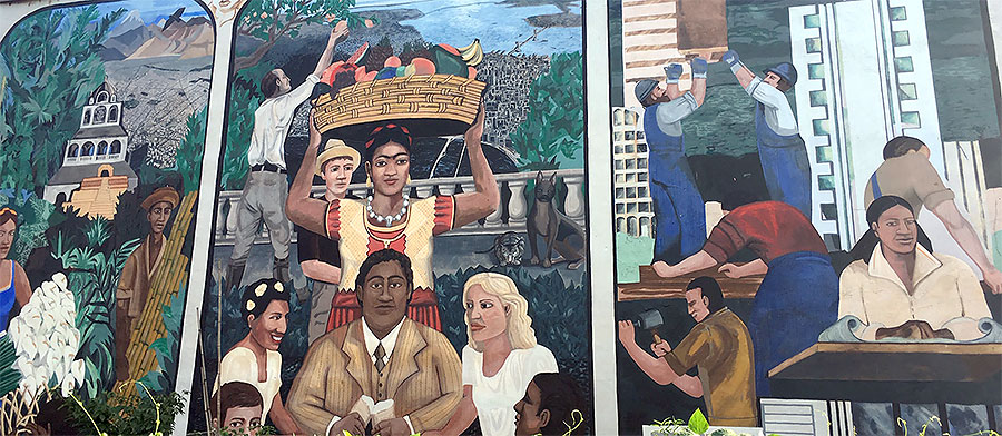
We launched the WordCamp Philly 2018 website back in April with a look at the city’s amazing murals that contributed to the design of the site. Appropriately, we’re coming to the end of our event weekend as Philly approaches the end of Mural Arts Month — another celebration of community.
Oddly, we had not planned this. Our celebration of something uniquely Philly is the serendipitous end to a tale of loss, lack of design talent and smartphone cameras.
Last spring we were kicking around ideas for this year’s theme and design, and I mentioned the photography of Jason, a network specialist I work with. One particular photo — a black-and-white overlooking the rail tracks in West Philly with Center City in the background — inspired us, and we received permission to use it.
The design team was inspired by the 2018 Paris site with its black-and-white photography and pops of color. Ours would feature a grittier (but not Gritty-er) feel inspired by the city’s graffiti. And so the work started.
That’s when we lost our lead designer for several weeks. Work events happen, family events happen, and the WordCamp Philly 2018 team had more than the usual share of both this year. Fortunately, they’re also flexible folks, and when one person wasn’t free for a time, another has lent a hand.
The team is blessed with several gifted designers, but two were newcomers just joining us at that time, and the talented Liam Dempsey was, of course, busy leading the group. I was eager to get the site launched so I could start getting content out, and I offered to take a look at it.
While talking about the graffiti elements of the proposed design, we were concerned that we wouldn’t the art we needed. Anticipating the need, I started watching for graffiti and street art to shoot any time I was in the city, thinking we could use it in a pinch. What I mostly found was Philly’s murals. Lots of murals. I had more to work with than I could ever use for one site.
A true designer can take a lot of disparate elements and make them play gracefully together as part of a whole. I am not a designer.
I pounded my head against a wall for days trying to mesh the chaotic, colorful and ephemeral art with the enduring black-and-white symmetry of the photo it was supposed to go with. I couldn’t do it. And with a deadline looming, I was nearly in tears from frustration.
Finally, I decided since I couldn’t make the pieces go where I wanted them to, I’d see where it was that they were trying to take me. I’ve heard of literary characters who took on their own life and said and did things the author never expected, but this is the first time I’d encountered it in a visual project.
And so, following the art, I ended up with the old concrete background pattern, the brown of the footer and the header font. The page content headers started falling into place, and the font colors started working.
But I still hadn’t found, among the stash of images I’d shot, exactly the right header. I tried the mural of the city. I tried the diversity mural. None of them were right.
Desperate for other options, I remembered a friend of mine, Cliff, who loved to bike around Philly and shoot anything that caught his eye — including murals. He generously gave his permission to use any of his work for free (his philosophy was that he just captured the art and it was unfair to profit from it).
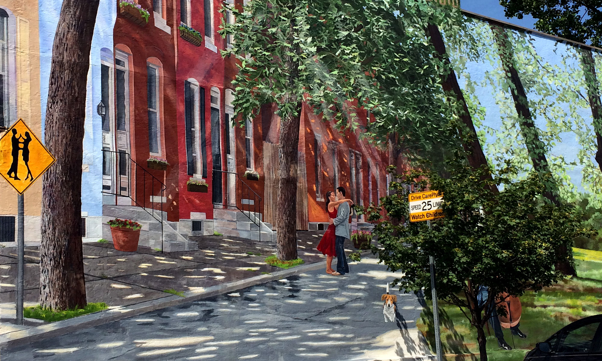
Grabbing a copy of his shot of the Fairmount Waltz mural, I popped it into the header as a placeholder, thinking I could shoot it again later if it worked.
And it was exactly right. It was the piece of the puzzle we’d been waiting for, pulling everything else into place.
So we had a design to launch with. The artwork has continued to inspire us through the WordCamp planning period, and we’ve featured it weekly on our Twitter and Facebook pages.
If you’ve missed them and have an interest in such things, I’ve posted the art from all the murals we’ve featured in a public Facebook album. For every piece I shot over the past several months, I saw one or two others that were too far away, at the wrong angle, in bad light or were the wrong dimensions for social media.
And that’s not including the other beautiful and amazing things I saw along the way. I could do a whole other site with Philly’s statuary (theme: “Don’t Blink!) or the domes, spires, columns and cornices of its architecture. This is a city of visual feasts, underappreciated because they’re random finds rather than centrally planned and curated.
I feel as though I owe an apology to the rest of the organizing team — and especially those on the web design team — for utterly failing to execute the original vision. We seem to have done OK for all that.
I owe a thanks to Jason, who graciously said we can try again with his photo next year if we want to. I owe one to Cliff for unexpectedly bailing me out.
And most of all, I owe a thanks to all of the artists — whether with Mural Arts Philly or not — who have worked (sometimes for decades) to bring the city’s neighborhoods to life with their creations. You make Philly a better place. If our site design was a success, it was a success because of you. We just recorded and presented your work.
Mural Arts Month continues through Wednesday with various events. They also offer walking, bicycle, trolley and train tours of the works over the course of the year. If you live in the city, or if you come back for another visit, I hope you’ll check them out. Bring a camera.

